In the world of branding, theory can only take you so far. The true lessons—the ones that stick, that inform strategy, and that prevent costly mistakes—are often found in the real-world stories of brands that have navigated the treacherous waters of transformation. Some have emerged as icons of strategic brilliance, their rebrands now legendary case studies in business schools. Others have become cautionary tales, their missteps serving as stark warnings about the perils of hubris, haste, and a failure to listen to the very audience they aim to serve.
Examining these triumphs and tribulations provides an invaluable education in brand strategy. By dissecting the “why” behind a successful pivot and the “how” of a disastrous fumble, we can extract enduring principles that apply to any business considering a change. This article will delve into some of the most famous rebranding successes and failures, exploring what companies like Apple, Gap, and Twitter can teach us about the art and science of brand reinvention.
Lessons from Successful Rebrands
Successful rebrands are rarely about just a new logo. They are the external manifestation of a deep, internal strategic shift. The new brand becomes a powerful symbol of a new direction, a new promise, or a new way of thinking.
1. Apple: The Rebirth of an Icon
The Context
In the late 1990s, Apple was on the brink of bankruptcy. Its brand was associated with a niche group of creative professionals and was losing ground rapidly to the dominance of Microsoft Windows.
The Rebrand
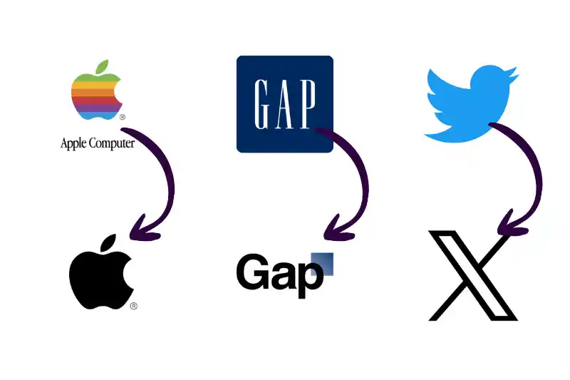
With the return of Steve Jobs in 1997, Apple embarked on one of the most successful rebrands in history. It was a multi-faceted transformation. The company simplified its complex logo, dropping the rainbow colours for a sleek, monochromatic look. It also dropped “Computer” from its name, a prescient move that opened the door for diversification into music (iPod), phones (iPhone), and more. But the masterstroke was the “Think Different” campaign. It didn’t sell product features; it sold an ideology. It aligned the brand with creative geniuses and revolutionaries, making the act of buying an Apple product a statement of identity.
The Lesson
The Apple rebrand teaches us that the most powerful transformations are driven by a clear and audacious strategic vision. Jobs didn’t just want to sell more computers; he wanted to change the world. The rebrand was a tool to communicate that vision. It also shows the power of selling an aspirational lifestyle, not just a product. People don’t buy Apple products simply for their functionality; they buy them for what they represent. This is a core principle of modern
branding.
2. Old Spice: From Granddad’s Aftershave to Viral Sensation
The Context
For decades, Old Spice was a brand firmly associated with an older generation. Its market was shrinking, and it was widely perceived as dated and irrelevant to younger consumers.
The Rebrand
In 2010, Old Spice launched “The Man Your Man Could Smell Like” campaign. It was a radical departure from traditional men’s grooming advertising. The campaign was humorous, surreal, and directly addressed a female audience (who often purchase grooming products for their male partners). It was a masterclass in viral marketing, leveraging social media to create a cultural moment. The rebrand didn’t change the logo or the product much; it completely overhauled the brand’s personality and voice.
The Lesson
Old Spice demonstrates that a rebrand can be achieved through bold, unexpected messaging and a complete perception overhaul. You don’t always need to change your name or logo to reinvent your brand. By changing the conversation and the tone, Old Spice made itself relevant and desirable to a whole new generation. It’s a powerful example of how creative marketing can be the primary driver of a rebrand.
3. Dunkin’: Evolving with the Customer
The Context
Dunkin’ Donuts was a beloved brand, but its name was becoming a limitation. The company had increasingly become a beverage-led business, with coffee accounting for a majority of its sales. The “Donuts” in its name didn’t reflect this reality and could be perceived as unhealthy by modern consumers.
The Rebrand
In 2018, the company officially rebranded to simply “Dunkin'”. It was a strategic simplification. They kept their iconic font and colour palette, ensuring they retained their hard-earned brand equity. The move repositioned them as a “beverage-led, on-the-go brand,” aligning perfectly with evolving consumer habits.
The Lesson
The Dunkin’ rebrand is a masterclass in strategic simplification and evolution. It shows that you can modernise and reposition your brand without alienating your existing customer base. By retaining key visual elements, they ensured continuity while the name change signalled a clear strategic shift. This is a crucial consideration for any established brand, as we often advise in our
digital consultancy services.
Lessons from Common Rebranding Mistakes
If successes teach us what to do, failures teach us what not to do. Rebranding missteps are often rooted in a disconnect from the customer and an underestimation of existing brand equity.
1. Gap: The Logo Change That Lasted a Week
The Context
In 2010, Gap, a brand with an iconic and globally recognised logo, abruptly launched a new logo on its website without any warning or explanation. The new design replaced the classic, serif-font text inside a blue box with a simple Helvetica font and a small, gradient blue square.
The Rebrand Failure
The public reaction was immediate and overwhelmingly negative. A digital firestorm erupted on social media, with customers and designers alike panning the new logo as cheap, generic, and soulless. It was seen as a corporate, top-down decision that ignored the emotional connection customers had with the iconic original. Within six days, Gap capitulated and reverted to its old logo. The failed experiment was estimated to have cost the company millions.
The Lesson
The Gap fiasco is the ultimate cautionary tale about underestimating customer sentiment and the value of brand equity. A logo is not just a design; it’s a repository of memories, experiences, and trust. The key takeaway is to always test new concepts with your target audience before a full launch. A rebrand should be a conversation with your customers, not a decree from on high.
2. Tropicana: When a Redesign Hides the Product
The Context
In 2009, Tropicana, a leader in the orange juice market, decided to “modernise” its packaging. It replaced its iconic and highly recognisable carton—featuring an orange with a straw sticking out of it—with a sleek, minimalist design that showed a generic glass of orange juice.
The Rebrand Failure
The result was a commercial disaster. Loyal customers couldn’t find the product on the shelves. The new packaging was so generic that it blended in with store-brand competitors, losing its premium appeal. Sales plummeted by 20% in two months, a loss of tens of millions of dollars. Tropicana quickly scrapped the new design and reverted to the original.
The Lesson
Tropicana’s failure teaches us to never sacrifice recognition for modernity. Your packaging and visual identity are crucial navigational aids for consumers. Drastically changing these elements can make your product invisible. The lesson is to maintain familiarity in a rebrand, especially with visually distinctive elements that customers rely on to identify your product. This is a critical aspect of both
branding and user experience-focused
web design.
3. Twitter (X): A Rebrand in Search of a Strategy
The Context
In 2023, under new ownership, Twitter was abruptly rebranded as “X”. The iconic blue bird logo, a globally recognised symbol of real-time conversation, was replaced with a stylised ‘X. ‘
The Rebrand Failure
The change was met with widespread confusion and ridicule. Unlike successful rebrands, there was no clear, communicated strategic purpose behind the change that resonated with users. The name “X” was seen as generic and lacking the personality and verb-like utility of “Twitter” (“to tweet”). The move was perceived as an ego-driven decision that discarded over a decade of immense brand equity for an unclear vision.
The Lesson
The Twitter-to-X saga highlights that a rebrand must clarify, not complicate, a brand’s identity. A rebrand without a compelling and well-communicated “why” is destined to fail. It underscores the danger of an internal-centric approach that ignores the deep emotional and functional connection users have with a brand. It’s a stark reminder that brand equity is a precious asset that, once destroyed, is incredibly difficult to rebuild. This is a key consideration for any
SEO consultancy, as the loss of a powerful brand name can have devastating effects on organic search traffic.
The Enduring Lessons for Your Brand
The stories of these brands offer a powerful set of guiding principles for any organisation considering a rebrand.
- Success is Strategic. Triumphant rebrands like Apple’s and Dunkin’s were rooted in deep strategic shifts. The new brand was a vehicle to communicate a new business direction.
- Failure is often an Inside Job. Failed rebrands like Gap’s and Tropicana’s were often the result of internal decisions that failed to consider the external reality of customer perception and loyalty.
- Listen to Your Audience. The most critical lesson is to involve your audience. Research, testing, and listening to feedback are not optional steps; they are essential risk mitigation strategies.
- Don’t Destroy Equity, Evolve It. Recognise the value of what you already have. Successful rebrands often find ways to evolve existing brand elements, maintaining a thread of continuity that reassures loyal customers.
- Authenticity is Paramount. Your rebrand must be an authentic reflection of who you are and where you are going. If it’s just a cosmetic change without substance, your audience will see right through it.
As you contemplate your own brand’s future, look to these examples. Learn from Apple’s vision, Old Spice’s creativity, Gap’s humility, and Tropicana’s oversight. By understanding these powerful lessons, you can navigate the complexities of rebranding with greater wisdom, ensuring your next chapter is a story of success, not a cautionary tale.